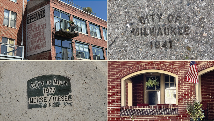
Use of a custom font and shapes found in the community reinforce a look that is Milwaukee-centric…
 By Paul Marszalek
TheTop22.com
As Radio Milwaukee entered its 15th year (which it cleverly positioned as its quinceañera), the station updated its brand identity.
The three primary products, led by 88NINE (WYMS), Urban Alternative HYFIN, and local initiative 4ONE4 Music.FM each received a fresh look under the umbrella of Radio Milwaukee.
It’s important to remember that a brand is the emotional connection that a consumer has with a product. Radio stations often get this wrong, mistaking their logo or their format for their brand. Many national radio formats fail or under-perform because they simply cannot generate an emotional connection to the audience. In turn, no one anywhere has an Alt bumper sticker on their car or laptop, for example.
No one gets excited about generic offerings.
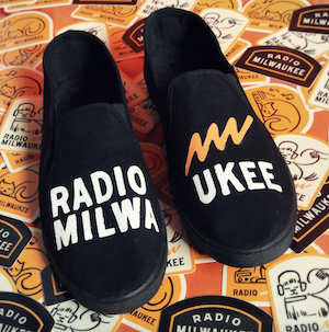
Radio Milwaukee understands this, and the organization made a concerted effort to reflect their neighborhood in logo design.
A custom font, called “Sidewalk Block” was created to emulate area sidewalk stamps, and shapes that mimic elements of local architecture were incorporated.
Watch the video below for additional background…
